ShopDreamUp AI ArtDreamUp
Deviation Actions
A bit of a change in the format, but my interest in transport not only covers railways and cars, but also aircraft. Aircraft on their own are interesting enough, how we somehow managed to get several hundred tonnes of metal, furnishings and people into the air and have them travel thousands of miles per day at speeds over 500mph is truly a testament to human ingenuity, but what makes these magnificent pieces of modern engineering even more interesting are the colours that each company gives their plucky airbourne workhorses.
So today I'm counting down my Top 20 favourite airline liveries, these being based on both their colourscheme and how they represent the airline in general. As usual, these are all opinion based and if you have a favourite livery, be sure to mention your own in the comments below!
#20. Cathay Pacific (1970 - 2001)

Green isn't exactly my favourite colour, but in the crisp lines of the previous Cathay Pacific livery it does look very, very good, especially on the Lockheed Tristar and the Boeing 747. Sadly it is comparatively bland, especially on the rudder, so it falls to the bottom of our list today. But that doesn't make it a bad livery by any means!
#19. Virgin Express (2002 - 2006)

The second and final livery to be placed on this short-lived domestic arm of Richard Branson's empire, this version of the Virgin Express livery I put over the original largely due to the modified tail colouring with the blue surround at the rear of the fuselage to keep in line with the changing image of the Virgin's aviation sectors. The original had simply a white tail whilst the rest of the aircraft was red, which, though striking, simply wasn't as good as its replacement.
#18. LTU Lufttransport-Unternehmen GmbH (1965 - 2009)

Another very crisp livery that truly suited the lines of any aircraft it was worn by, the LTU livery was one I remember fondly from my childhood as LTU Tristar flights from Germany to the United States would frequently fly over my house. It falls down the list due largely to it being a touch bland, but otherwise a fantastic livery!
#17. Monarch Airlines (1983 - 2002)

Certainly looking very regal, the previous Monarch livery certainly made its aircraft look organised, although the colourscheme of yellow and dark-brown always struck me as a bit of an unusual combination. Nevertheless, it still made their aircraft look very uniform.
#16. Royal Jordanian (1985 - Present)

Another very regal looking design, Royal Jordanian's livery has always had my admiration, with its dark lines and beige waistband complimenting the profile of any aircraft that wears it. Why is it down at #16? Largely because it only really looks good in sunny weather, in cloudy conditions its dark colours look somewhat depressing and dull. Good thing the sun always shines at 35,000 feet!")
#15. Ryanair (2000 - Present)
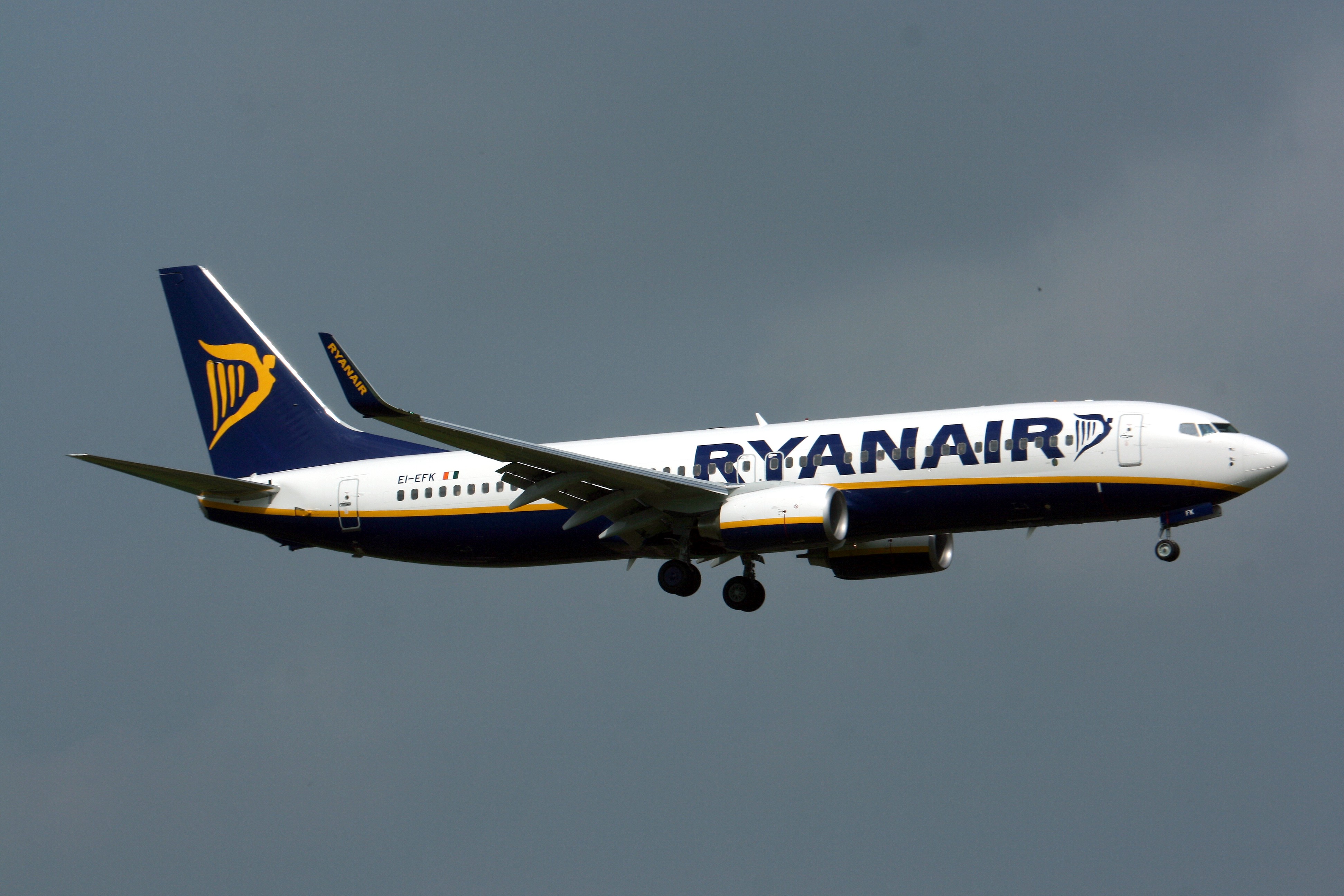
I'm gonna get a lot of hatred for even considering putting Ryanair on any top-10 list for good reasons, but I honestly have to say that they do have a very good livery, surprisingly crisp, colourful and uniform for a low-cost carrier!
#14. Virgin Sun (1999 - 2001)
.jpg)
No, I'm not being paid by the Bearded One (though sometimes I wish I was), and I'm sure he'd sooner forget the short-lived venture that was Virgin Sun more than anyone else. But Virgin Sun did have the distinction of having a very sunny livery, distinguishable with its yellow fuselage and red tail, it looks fantastic! If I had been going on holiday with them in 1999, this livery would have got me very excited!
#13. Federal Express (1973 - 1994)
_(N612FE48605555).jpg)
Few people remember the original Fedex livery, but it was something very interesting and surprisingly eyecatching, even for humble cargo planes! The modern livery by comparison is somewhat bland, and I really hope that one day the company considers a retro version because this livery looks good on just about any aircraft!
#12. Trans-World Airlines (1997 - 2001)

The final livery of the veteran American carrier, while most associate the airline with its red waistband scheme of the 1960's to 1990's, my personal favourite was their last-minute stroke of inspiration, culminating in a fantastically crisp and uniform layout. It's a shame both this and TWA in general didn't last longer.
#11. British West Indian Airways (1964 - 2001)

One of the longest running liveries on this countdown, the BWIA gold first made its appearance on brand-new Boeing 727's in the mid-1960's, and gradually evolved with time with each new series of aircraft, from Tristars of the 70's to A320's of the 90's. The beautiful gold and aquamarine cheatline together with the tail design help make this one of my childhood faves, always a pleasure to see on the ground at Heathrow!
#10. Southwest Airlines (1971 - 2001)
.jpg)
Some real nostalgia on this one! When I used to buzz around California and the rest of the United States with my family in the 1990's, Southwest Airlines' gold and red would always be our first choice! Whether it was flying from Los Angeles to Reno, Las Vegas to San Diego, BWI to Albany and so forth, this sunny livery would always bring a smile to my face, and it still does!
#9. BOAC (1965 - 1975)

A little before my time, but still a legendary livery! The final livery to be worn by the British National Carrier before it was nationalised into British Airways truly cemented itself as the original Speedbird, the UK callsign for our Flag Airline. The livery looked especially good on the Vickers VC10 and Boeing 707, but seemed a touch out of place on the Boeing 747.
#8. US Airways (1995 - 2005)
_US-Airways.jpg)
Now this was an eyecatching livery, a sweeping black upper-body complimented by neatly spaced red and white lines and the American flag proudly placed upon the tail, it was amazing! In fact my first encounter with this livery was at Universal Studios Florida on the now closed Earthquake: The Big One! ride, where a US Airways advert could be seen in the fake Subway station which was torn to pieces by a violent tremor. Ironic how I remember very little else about that ride, but a US Airways poster is what sticks in my head the most!
#7. Caledonian Airways (1988 - 2000)

Rising from the ashes of the former British Airways subsidiary British Airtours, Caledonian Airways was the second airline to carry this name, and wore a livery similar to British Airways' Landor livery of the 1980's to keep it in similar look. Though differing with tail logo and colour of the waistline, it's still a fantastic livery and undeniably British!
#6. Delta Airlines (1959 - 2000)

The pride of the airline for 41 years, Delta Airlines' Widget livery became one of the most iconic colourschemes in the aviation world throughout the peak of the classic Jet Age. I always had a love for this livery, though the livery that followed this in 2000 was a close contender, but seeing those lines upon a Tristar was just gorgeous!
#5. British Midland (1985 - 2000)

One of my first memories as a baby was flying aboard a British Midland Boeing 737 from Heathrow to Frankfurt, and the one-second glimpse I can recall of one of these planes at the gate in London has bounced around my mind for over 20 years! It was one of the most eyecatching liveries in UK aviation, a stark contrast to British Airways and its largely white colours.
#4. United Airlines (1994 - 2001)
_(6907157547).jpg)
Dubbed 'Battleship Grey', many people have major complaints about this livery, with the words bland and distasteful being thrown around frequently. But I personally adored this livery as a child. Growing up, I'd often fly to the United States with United Airlines as they really were a brilliant choice, affordable and reliable, especially since British Airways couldn't help but be on strike for most of the 90's! Not sure what American sentiment towards United Airlines in the 1990's was, but for us Brits they were the perfect choice!
I grew very accustomed with these Grey beasts of the sky, and even though they've all disappeared now, I still remember them fondly in my heart!
#3. Northwest Airlines (1989 - 2003)

The good old 'Bowling Shoe', Northwest Airlines' livery for the 90's was indeed colourful and eyecatching. I'll never forget seeing lines of their Boeing 747's in this amazing livery at Seattle awaiting departure with Trans-Pacific flights to Japan and China. What hurt the most was not when this livery disappeared, but was the fact that the next livery, which attempted to harp back to the bare-metal Northwest Orient livery of the 1970's, was among the most bland ever put on an airplane. In the Bowling Shoe livery though, anything suited its sublime colours, especially 747's!
#2. British Airways (1984 - 1999)

Named after the promotion consultancy company Landor Associates, British Airways' Landor Livery was a huge step-up from the original British Airways colours. With a sensible and crisp waistline, a red slash along the side, and the tail representing the British flag, it truly did cement itself as the Flag Carrier for the UK. The modern livery may be nice, but it barely represents the British flag, and how can we forget the Public Relations disaster that was the 'Ethnic' liveries of the late 1990's, confusing passengers and showing everyone else's flag apart from our own!
The Landor livery looked especially good on Tristars, DC-10s, 737's, Tridents, BAC 1-11's, but most of all Concorde!
#1. American Airlines (1970 - 2014)
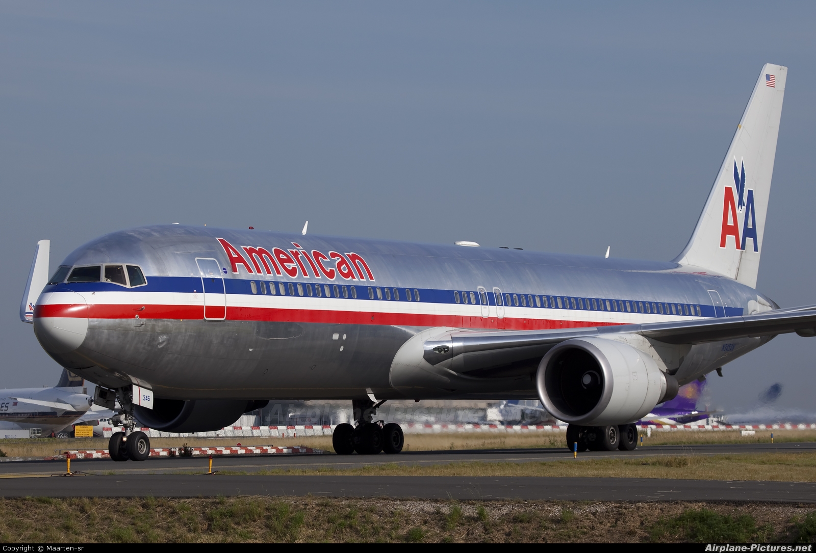
It was very tough trying choosing between this and British Airways, my head said BA, my heart said AA. But eventually, I had to go with the Silver Bullet, the true depiction of the red, white and blue, no better symbol of an American flag-carrier than American Airlines. At 44 years in circulation this livery is the longest worn on this countdown, but throughout the years it had something of a timeless feel to it, a crisp and simplistic design that perfectly represented the United States wherever it went and on whatever plane was lucky enough to carry it.
I've always adored this livery, I was heartbroken to see it go, I hope someday it'll make a comeback!
So today I'm counting down my Top 20 favourite airline liveries, these being based on both their colourscheme and how they represent the airline in general. As usual, these are all opinion based and if you have a favourite livery, be sure to mention your own in the comments below!
#20. Cathay Pacific (1970 - 2001)
Green isn't exactly my favourite colour, but in the crisp lines of the previous Cathay Pacific livery it does look very, very good, especially on the Lockheed Tristar and the Boeing 747. Sadly it is comparatively bland, especially on the rudder, so it falls to the bottom of our list today. But that doesn't make it a bad livery by any means!
#19. Virgin Express (2002 - 2006)
The second and final livery to be placed on this short-lived domestic arm of Richard Branson's empire, this version of the Virgin Express livery I put over the original largely due to the modified tail colouring with the blue surround at the rear of the fuselage to keep in line with the changing image of the Virgin's aviation sectors. The original had simply a white tail whilst the rest of the aircraft was red, which, though striking, simply wasn't as good as its replacement.
#18. LTU Lufttransport-Unternehmen GmbH (1965 - 2009)
Another very crisp livery that truly suited the lines of any aircraft it was worn by, the LTU livery was one I remember fondly from my childhood as LTU Tristar flights from Germany to the United States would frequently fly over my house. It falls down the list due largely to it being a touch bland, but otherwise a fantastic livery!
#17. Monarch Airlines (1983 - 2002)
Certainly looking very regal, the previous Monarch livery certainly made its aircraft look organised, although the colourscheme of yellow and dark-brown always struck me as a bit of an unusual combination. Nevertheless, it still made their aircraft look very uniform.
#16. Royal Jordanian (1985 - Present)
Another very regal looking design, Royal Jordanian's livery has always had my admiration, with its dark lines and beige waistband complimenting the profile of any aircraft that wears it. Why is it down at #16? Largely because it only really looks good in sunny weather, in cloudy conditions its dark colours look somewhat depressing and dull. Good thing the sun always shines at 35,000 feet!
#15. Ryanair (2000 - Present)
I'm gonna get a lot of hatred for even considering putting Ryanair on any top-10 list for good reasons, but I honestly have to say that they do have a very good livery, surprisingly crisp, colourful and uniform for a low-cost carrier!
#14. Virgin Sun (1999 - 2001)
No, I'm not being paid by the Bearded One (though sometimes I wish I was), and I'm sure he'd sooner forget the short-lived venture that was Virgin Sun more than anyone else. But Virgin Sun did have the distinction of having a very sunny livery, distinguishable with its yellow fuselage and red tail, it looks fantastic! If I had been going on holiday with them in 1999, this livery would have got me very excited!
#13. Federal Express (1973 - 1994)
Few people remember the original Fedex livery, but it was something very interesting and surprisingly eyecatching, even for humble cargo planes! The modern livery by comparison is somewhat bland, and I really hope that one day the company considers a retro version because this livery looks good on just about any aircraft!
#12. Trans-World Airlines (1997 - 2001)
The final livery of the veteran American carrier, while most associate the airline with its red waistband scheme of the 1960's to 1990's, my personal favourite was their last-minute stroke of inspiration, culminating in a fantastically crisp and uniform layout. It's a shame both this and TWA in general didn't last longer.
#11. British West Indian Airways (1964 - 2001)
One of the longest running liveries on this countdown, the BWIA gold first made its appearance on brand-new Boeing 727's in the mid-1960's, and gradually evolved with time with each new series of aircraft, from Tristars of the 70's to A320's of the 90's. The beautiful gold and aquamarine cheatline together with the tail design help make this one of my childhood faves, always a pleasure to see on the ground at Heathrow!
#10. Southwest Airlines (1971 - 2001)
Some real nostalgia on this one! When I used to buzz around California and the rest of the United States with my family in the 1990's, Southwest Airlines' gold and red would always be our first choice! Whether it was flying from Los Angeles to Reno, Las Vegas to San Diego, BWI to Albany and so forth, this sunny livery would always bring a smile to my face, and it still does!
#9. BOAC (1965 - 1975)
A little before my time, but still a legendary livery! The final livery to be worn by the British National Carrier before it was nationalised into British Airways truly cemented itself as the original Speedbird, the UK callsign for our Flag Airline. The livery looked especially good on the Vickers VC10 and Boeing 707, but seemed a touch out of place on the Boeing 747.
#8. US Airways (1995 - 2005)
Now this was an eyecatching livery, a sweeping black upper-body complimented by neatly spaced red and white lines and the American flag proudly placed upon the tail, it was amazing! In fact my first encounter with this livery was at Universal Studios Florida on the now closed Earthquake: The Big One! ride, where a US Airways advert could be seen in the fake Subway station which was torn to pieces by a violent tremor. Ironic how I remember very little else about that ride, but a US Airways poster is what sticks in my head the most!
#7. Caledonian Airways (1988 - 2000)
Rising from the ashes of the former British Airways subsidiary British Airtours, Caledonian Airways was the second airline to carry this name, and wore a livery similar to British Airways' Landor livery of the 1980's to keep it in similar look. Though differing with tail logo and colour of the waistline, it's still a fantastic livery and undeniably British!
#6. Delta Airlines (1959 - 2000)
The pride of the airline for 41 years, Delta Airlines' Widget livery became one of the most iconic colourschemes in the aviation world throughout the peak of the classic Jet Age. I always had a love for this livery, though the livery that followed this in 2000 was a close contender, but seeing those lines upon a Tristar was just gorgeous!
#5. British Midland (1985 - 2000)
One of my first memories as a baby was flying aboard a British Midland Boeing 737 from Heathrow to Frankfurt, and the one-second glimpse I can recall of one of these planes at the gate in London has bounced around my mind for over 20 years! It was one of the most eyecatching liveries in UK aviation, a stark contrast to British Airways and its largely white colours.
#4. United Airlines (1994 - 2001)
Dubbed 'Battleship Grey', many people have major complaints about this livery, with the words bland and distasteful being thrown around frequently. But I personally adored this livery as a child. Growing up, I'd often fly to the United States with United Airlines as they really were a brilliant choice, affordable and reliable, especially since British Airways couldn't help but be on strike for most of the 90's! Not sure what American sentiment towards United Airlines in the 1990's was, but for us Brits they were the perfect choice!
I grew very accustomed with these Grey beasts of the sky, and even though they've all disappeared now, I still remember them fondly in my heart!
#3. Northwest Airlines (1989 - 2003)
The good old 'Bowling Shoe', Northwest Airlines' livery for the 90's was indeed colourful and eyecatching. I'll never forget seeing lines of their Boeing 747's in this amazing livery at Seattle awaiting departure with Trans-Pacific flights to Japan and China. What hurt the most was not when this livery disappeared, but was the fact that the next livery, which attempted to harp back to the bare-metal Northwest Orient livery of the 1970's, was among the most bland ever put on an airplane. In the Bowling Shoe livery though, anything suited its sublime colours, especially 747's!
#2. British Airways (1984 - 1999)
Named after the promotion consultancy company Landor Associates, British Airways' Landor Livery was a huge step-up from the original British Airways colours. With a sensible and crisp waistline, a red slash along the side, and the tail representing the British flag, it truly did cement itself as the Flag Carrier for the UK. The modern livery may be nice, but it barely represents the British flag, and how can we forget the Public Relations disaster that was the 'Ethnic' liveries of the late 1990's, confusing passengers and showing everyone else's flag apart from our own!
The Landor livery looked especially good on Tristars, DC-10s, 737's, Tridents, BAC 1-11's, but most of all Concorde!
#1. American Airlines (1970 - 2014)
It was very tough trying choosing between this and British Airways, my head said BA, my heart said AA. But eventually, I had to go with the Silver Bullet, the true depiction of the red, white and blue, no better symbol of an American flag-carrier than American Airlines. At 44 years in circulation this livery is the longest worn on this countdown, but throughout the years it had something of a timeless feel to it, a crisp and simplistic design that perfectly represented the United States wherever it went and on whatever plane was lucky enough to carry it.
I've always adored this livery, I was heartbroken to see it go, I hope someday it'll make a comeback!
Road Rumble: Alfa Romeo RZ and SZ
One of Alfa Romeo's most obscure productions, but at the same time one of their finest, the SZ and RZ, or Sprint Zagato and Roadster Zagato, respectively, are a rare pair of limited edition machines built in the 1990's to give them something of an edge in a time when they were making somewhat mundane family cars.
Robert Opron of the FIAT design studio was responsible for the initial sketches while Antonio Castellana was largely responsible for the final styling details and interior. Only the 'Z' logo of Zagato was kept. The car possessed unusual headlights positioned in a trio on each side - a styling used more subtly on later Alfa Romeos in
Review: Shanghai Y-10
Behold! China's rip-off... err... I mean, replica of the mighty Boeing 707, the Shanghai Y-10, the country's first and, for a while, only commercial jet airliner, which ended being a long forgotten relic of the communist system.
Communist China, until recently, has never truly had an aviation industry, at least, not in the same respects as many other nations. Many of their constructs during the dark days of the Cold War were license built versions of Soviet models, such as the Xian H-6 bomber, the nation's first jet powered aircraft that was a rebuild of the Tupolev Tu-16. The H-6, which flew in 1959, was also the largest aircraft China had
Road Rumble: MG MGB
Oh the MGB, the last great British Sports car?
A motor that refused to die even though British Leyland simply couldn't stop messing around with it. The MGB is an example of a car that went from one of the most loved and lovable cars in British motoring, to what many describe as an empty husk broken and bent for legislation purposes. But the MGB would have its way in the end!
The story behind the MGB begins in 1962, when the car was designed to incorporate an innovative, modern style utilizing a monocoque structure instead of the traditional body-on-frame construction used on both the MGA and MG T-types and the MGB's rival, the Triumph TR se
Review: McDonnell Douglas MD-90
The last of the true McDonnell Douglas DC-9 derivatives before the purchase by Boeing, the MD-90 was to become the longest and most efficient of the MD-80 range, a new face for a 30 year old design that had to maintain a desperate fight against its ever more influential rivals.
The MD-90, like the MD-80 that preceded it, can be traced back to the original Douglas DC-9 of 1965, a short-range companion to the company's first jet outing, the DC-8. The DC-9 was an all new design at the time, with two turbofan engines mounted at the rear of the fuselage, while the wings were positioned further towards the aft to compensate. It also included a T-T
Featured in Groups

© 2016 - 2024 The-Transport-Guild
Comments17
Join the community to add your comment. Already a deviant? Log In
Good choices!! The American livery was one of the best, as the combination of bare metal on the bottom/top and classic American flag stripes running down the middle was second to none. Battleship Grey and Rising Blue (the United livery that came out in 2005, which coexisted w/ the Battleship) until it was destroyed by the Death Star (what I like to call the stupid Continental Globe) was my favorite livery. Southwest still has three planes in the Desert Gold livery still flying around the country (N714CB, N711HK, and N792SW).